The pass’s style determines the overall visual appearance of the pass and the template for placement of information on the pass. The most distinctive visual indication of the style is at the top edge of the pass. Event tickets have a small cutout, coupons have a perforated edge, and so on.
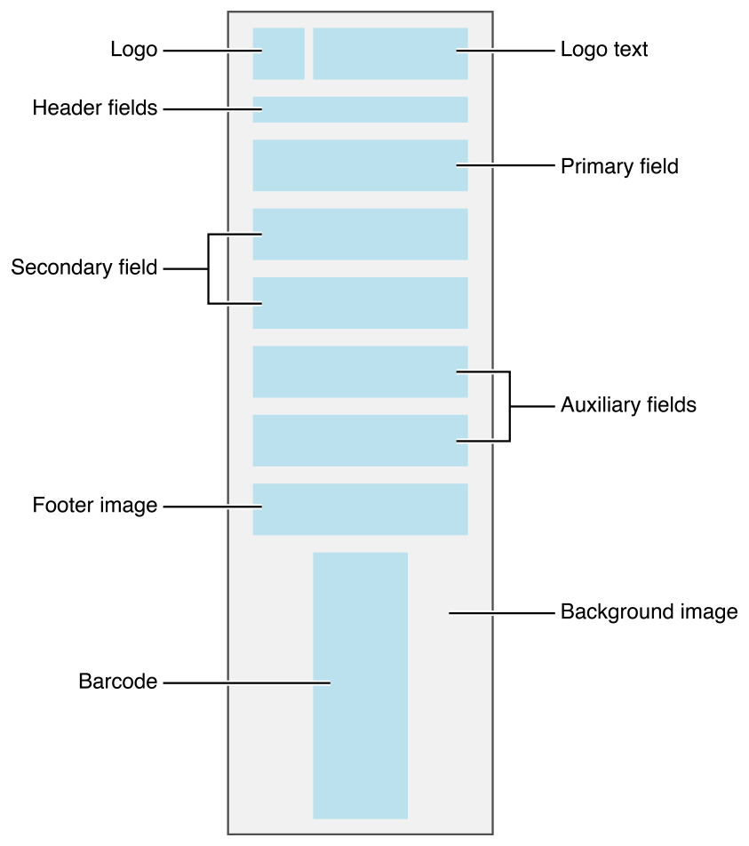
The pass style determines the maximum number of fields that can appear on the front of a pass:
- In general, a pass can have up to three header fields, a single primary field, up to four secondary fields, and up to four auxiliary fields.
- Boarding passes can have up to two primary fields and up to five auxiliary fields.
- Coupons, store cards, and generic passes with a square barcode can have a total of up to four secondary and auxiliary fields, combined.
- The number of fields displayed on the pass also depends on the length of the text in each field. If there is too much text, some fields may not be displayed.
Note: Do not include more fields than are displayed on the front of your pass. Although additional fields may not be shown today, layouts may change in the future, and you would not want a previously hidden field to suddenly become visible to users.
Layout of a boarding pass

Layout of a coupon

Layout of an event ticket

Layout of a generic pass

Layout of a store card

Designing Passes for Apple Watch
Even if you’re not creating watch-specific apps, users can add any passes you create to their Apple Watch. So you need to understand how Apple Watch handles passes, in order to create passes that function properly on both iPhone and Apple Watch.
Apple Watch presents a subset of the information available on iPhone. The following items are not available:
A strip image is not displayed.
A thumbnail image is not displayed.
The user cannot access the back side of the pass.
When laying out coupon, event ticket, store card, or generic passes, Apple Watch performs the following steps. If a pass does not provide (or does not support) a particular item, that item is skipped.
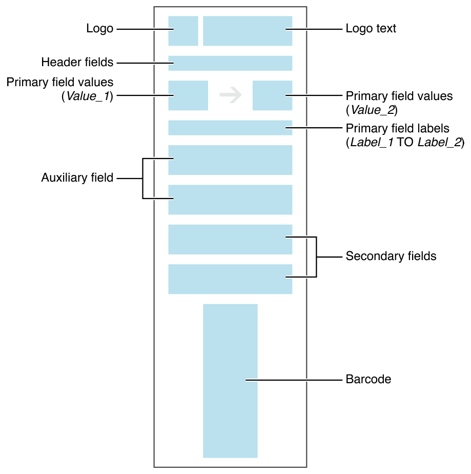
At the top of the pass, Apple Watch displays the logo and logo text. It attempts to degrade gracefully if both items do not fit. Specifically, if the pass has a logo, it always displays the logo, but it displays the logo text only when the text fits without being truncated. If the pass does not have a logo, it always displays the logo text, even if the text is truncated.
It displays header fields immediately under the logo and/or logo text in thin strips, one line per header field.
Apple Watch lays out all primary, secondary, and auxiliary fields from top to bottom, placing two fields on a line if possible. All primary fields appear first, followed by all secondary fields, followed by all auxiliary fields.
Apple Watch places two fields on the same line only if they belong to the same field type. For example, a primary and secondary field never appear on the same line.
Apple Watch places the footer image below all the fields. It crops white space from the footer image before positioning it.
Apple Watch places the barcode at the bottom of the pass. Note that rectangular barcodes are rotated to a portrait orientation to better fit on the watch face. The barcode is always the last item in the pass.
Apple Watch scales and blurs the background image so that it fills the pass. It then positions this image behind the other content.
Apple Watch uses a slightly different procedure when laying out boarding passes
When laying out the primary fields, Apple Watch takes the fields’ values and places them on the same line, separated by an appropriate transit icon.
Apple Watch combines the labels from the primary fields, joining them using the word “TO”—for example, SAN FRANCISCO TO NEW YORK. It places this text on the next line.
Apple Watch positions the auxiliary fields above the secondary fields.
NOTE
Future-proof your pass design by avoiding layout tricks, such as padding images with whitespace. While these techniques may let you fine-tune the pass’s appearance, they rely on implementation details that may change in future releases.
Users interact with notifications differently on iPhone and on Apple Watch.
On iPhone, both relevancy and update notifications appear on the Lock screen. Users swipe the notification to open the pass.
On Apple Watch, for relevancy notifications, users swipe down to see the notification in the Notification Center. If the user taps on the notification, the full pass is displayed inline.
On Apple Watch, update notifications present a message that describes the update and a button to view the pass. Users tap the button to open the full pass. Update notifications can also appear in Notification Center.